For this next challenge, I got to revisit an old book that I was published in. It is from 2004, Chatterbox's 25 Meaningful Albums. The challenge is Nicole's and it is to use a book or magazine cover as your inspiration. So, I used Chatterbox's book cover as my inspiration.
I decided I would use the lined up books as my background replacing them with patterned paper of course.
Here's my take:
My title wasn't showing up enough on the background so I rubbed my Stampin Up Crushed Curry stamp pad over the letters to make them pop a little. I like how it gave the grainy effect.
I sprayed the butterflies with white Mr. Huey mist- yum!
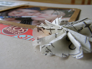
The next challenge was to stitch on a picture and it is Kimberly's challenge. I'm not much of a seamstress as some of you may know. I can't sew a straight line for the life of me and I never can get the tension right on the sewing machine. So for this stitching I wanted to make sure that didn't matter. So look closely at my picture for the stitching:
Yep, that's the stitching, just a couple little lines! This was my hardest challenge. If I get more time this week, maybe I will revisit this challenge. Here's the page:
P.S. winners posted soon for the stamp sets below!! (:


12 comments:
Love the way the books turned out! Great idea!
love how you interpreted the cover for your layout. i'm afraid of the stitching too but will have to give it a try.
These are BEAUTIFUL creations...love where you draw inspiration from too!
xo
Loves,
K
So creative how you used that ad! Awesome!
these are awesome! i really like the design on the 2nd one!! very cool
xo
Love your inspiration idea, Julie! The paper piecing turned out so cute!!!
Love the book cover layout, such a great design!
These are great layouts!
Great pages - I absolutely love what you did the the letters with the stamp pad. What a great effect! (and oh, how I miss Chatterbox :(
i love that layout.. the yellows..!! refreshing!
i love how you used the ink pad on the chipboard alphas...it looks kinda like woodgrain! loves! you've been a busy lady and i'm loving what i'm seeing!
Spunky! I like the word and the layout! :)
Post a Comment